引言
编码技巧
- currentColor 文本的颜色
背景与边框
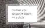
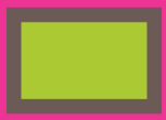
半透明边框
1
2
3
4
5
6
div {
padding: 50px;
border: 10px solid rgba(255,255,255,0.5);
background: red;
background-clip: padding-box; // 保留padding的背景
}
多重边框
box-shadow
1 | box-shadow: 0 0 0 10px #655, 0 0 0 20px red; |
- 不会影响布局,可通过内边距或外边距来模拟
- 不会影响鼠标事件,可以通过inset关键字加上内边距来实现
- 只能产生实线
outline
- 可以通过
outline-offset来指定与边缘的距离,可以为负值 - 没有圆角
灵活的背景定位
background-position方案
1 | background: url(***) no-repeat bottom right red; /* 回退方案 */ |
background-origin + padding方案
1 | padding: 10px; |
calc()
1 | background-position: calc(100% - 20px) calc(100% - 10px); |
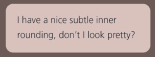
边框内圆角
1
2
3
4
5background: tan;
border-radius: .8em;
padding: 1em;
box-shadow: 0 0 0 .6em #655; // 可以根据border-radius计算得到
outline: .6em solid #655;
条纹背景
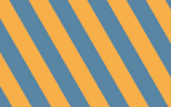
比较复杂,看书比较好理解
另外,这个:
https://hugogiraudel.com/2013/02/04/css-gradients/#a-few-things-about-linear-gradients
1 | background: linear-gradient(#fb3 33.3%, blue 0, blue 66.7%, red 0); /* 10px:10px:10px 最后面的30%可以写为0*/ |
1 | background: #58a; |
复杂的背景图案
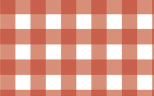
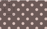
1
2
3
4
5
6/* 波点 */
background-image:
radial-gradient(tan 30%, transparent 0),
radial-gradient(tan 30%, transparent 0);
background-size: 30px 30px;
background-position: 0 0, 15px 15px;
1
2
3
4
5
6
7
8
9
10
11
12
13
14
15
16/* 棋盘 */
background-image:
linear-gradient(45deg, tan 25%, transparent 0),
linear-gradient(45deg, transparent 75%, red 0),
linear-gradient(45deg, blue 25%, transparent 0),
linear-gradient(45deg, transparent 75%, green 0);
background-size: 30px 30px;
background-position: 0 0, 15px 15px, 15px 15px, 0px 0px;
or
background-image:
linear-gradient(45deg, tan 25%, transparent 0, transparent 75%, tan 0),
linear-gradient(45deg, blue 25%, transparent 0, transparent 75%, blue 0);
background-size: 30px 30px;
background-position: 0 0, 15px 15px;
伪随机背景
“蝉原则”,质数的思想
连续的图像边框
1
2
3
4
5
6
7
8/* 老式信封样式边框 */
background: linear-gradient(white, white) padding-box,
repeating-linear-gradient(-45deg,
red 0, red 12.5%,
transparent 0, transparent 25%,
#58a 0, #58a 37.5%,
transparent 0, transparent 50%) 0 / 5em 5em;
background-origin: border-box;
1 | /* 蚂蚁行军边框 */ |
1 | /* 脚注 */ |
形状
自适应的椭圆
1 | /* 半椭圆 */ |
平行四边形
1 | button { |
菱形图片
1
2
3
4
5
6
7
8
9
10
11
12.picture {
margin: 200px auto;
width: 155px;
height: 155px;
transform: rotate(45deg);
overflow: hidden;
border: 1px solid gray;
}
.picture > img {
max-width: 100%;
transform: rotate(-45deg) scale(1.42);
}
更好的方案
1 | img:hover { |
切角效果
四个角的切角效果
1
2
3
4
5
6
7
8background: #58a;
background:
linear-gradient(135deg, transparent 15px, #58a 0) top left,
linear-gradient(-135deg, transparent 15px, #58a 0) top right,
linear-gradient(-45deg, transparent 15px, #58a 0) bottom right,
linear-gradient(45deg, transparent 15px, #58a 0) bottom left;
background-size: 50% 50%;
background-repeat: no-repeat;
内凹圆角
1
2
3
4
5
6
7background:
radial-gradient(circle at top left, transparent 15px, #58a 0) top left,
radial-gradient(circle at top right, transparent 15px, #58a 0) top right,
radial-gradient(circle at bottom left, transparent 15px, #58a 0) bottom left,
radial-gradient(circle at bottom right, transparent 15px, #58a 0) bottom right;
background-size: 50% 50%;
background-repeat: no-repeat;
svg + border-image 的方案1
2
3
4
5
6
7
8
9background: #58a;
background-clip: padding-box;
border: 15px solid #58a;
/* 1对应svg文件的坐标系统,可以用33.4% */
border-image: 1 url('data:image/svg+xml,\
<svg xmlns="http://www.w3.org/2000/svg"\
width="3" height="3" fill="%2358a">\
<polygon points="0,1 1,0 2,0 3,1 3,2 2,3 1,3 0,2"/>\
</svg>')
裁切路径方案1
2
3
4
5clip-path: polygon(
20px 0, calc(100% - 20px) 0, 100% 20px,
100% calc(100% - 20px), calc(100% - 20px) 100%,
20px 100%, 0 calc(100% - 20px), 0 20px
);
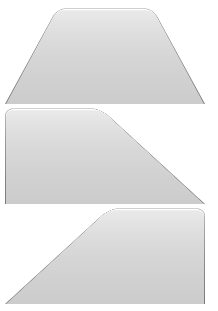
梯形标签页
1
2
3
4
5
6
7
8
9
10
11
12
13
14
15
16
17
18
19
20
21
22
23
24
25
26
27div::before {
content: '';
position: absolute;
top: 0; right: 0; bottom: 0; left: 0;
z-index: -1;
background: #ccc;
background-image: linear-gradient(hsla(0, 0%, 100%, .6), hsla(0, 0%, 100%, 0));
border: 1px solid rgba(0, 0, 0, .4);
border-bottom: none;
border-radius: 1em 1em 0 0;
box-shadow: 0 .15em white inset;
}
#div1:before {
transform: perspective(.5em) scaleY(2) rotateX(5deg);
transform-origin: bottom;
}
#div2:before {
transform: perspective(0.5em) scaleY(2) rotateX(5deg);
transform-origin: bottom left;
}
#div3:before {
transform: perspective(0.5em) scaleY(2) rotateX(5deg);
transform-origin: bottom right;
}
饼图
一个饼图动画
1 | @keyframes spin { |
各种比率的饼图
1 | <!--五分之一的饼图 因为20/50/2--> |
SVG解决方案
1 | <svg viewBox="0 0 32 32"> |
视觉效果
单侧投影
1 | box-shadow: 0px 5px 4px -4px rgba(0,0,0,.5); |
邻边投影
1 | box-shadow: 3px 3px 4px -2px rgba(0,0,0,.5); |
两侧投影
1 | box-shadow: 6px 0 4px -2px rgba(0,0,0,.5), |
不规则投影
1 | filter: drop-shadow(3px 3px 4px #000); |
- 可以用到伪元素,边框等
- 文字也会被打上投影,且不会受
text-shadow的影响
染色效果
1 | img { |
基于混合模式的方案
luminosity: 保留上层元素的HSL亮度信息,从下层吸取色相和饱和度信息
1 | <a> |
或
1 | .tinted-image { |
毛玻璃效果
1 | filter: blur(20px); |
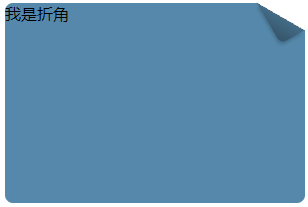
折角效果
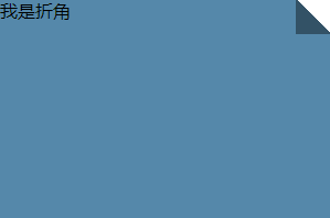
1 | div { |
30度的折角呢?
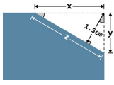
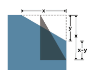
1 | div { |
字体排印
插入换行
1 | dt, dd { |
文本行的斑马条纹
1
2
3
4
5
6
7
8
9
10
11
12
13
14
15
16
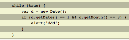
17pre {
padding: .5em;
line-height: 1.5;
background: beige;
background-image: linear-gradient(rgba(0,0,0,.2) 50%, transparent 0);
background-size: auto 3em;
background-origin: content-box;
}
<pre>
while (true) {
var d = new Date();
if (d.getDate() == 1 && d.getMonth() == 3) {
alert('ddd')
}
}
</pre>
调整tab的宽度
1 | tab-size: 2 |
华丽的&符号
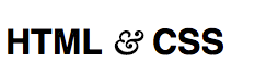
1
2
3
4
5
6
7
8
9
10
11@font-face {
font-family: Ampersand;
src: local('Baskerville-Italic'),
local('GoudyOldStyleT-Italic'),
local('Palatino-Italic'),
local('BookAntiqua-Italic');
unicode-range: U+26; /* '&'.charCodeAt(0).toString(16) => 26 */
}
h1 {
font-family: Ampersand, Helvetica, sans-serif;
}
自定义下划线
1
2
3
4
5
6
7
8
9
10a[href] {
text-decoration: none;
font-size: 60px;
/*background: linear-gradient(gray, gray) no-repeat;*/
background: linear-gradient(90deg, gray 66%, transparent 0) repeat-x; /* 虚线 */
background-repeat: repeat-x;
background-size: .2em 1px;
background-position: 0 1.15em;
text-shadow: .05em 0 white, -.05em 0 white; /* 不让下划线穿过字母 */
}
现实中的文字效果
凸版印刷效果
- 深色背景,浅色字体
给文字顶部加深色投影:text-shadow: 0 -1px 1px black
- 浅色背景,深色字体
给文字底部加浅色投影:text-shadow: 0 1px 1px white
空心字效果
1 | div { |
1 | <div> |
文字外发光效果
1 | div { |
文字凸起效果
1
2
3
4
5
6
7
8
9
10
11
12
13
14
15
16
17
18
19
20
21
22
23
24
25
26
27
28
29
30
31
32
33
34
35
36
37
38button {
outline: none;
border-radius: 20px;
border: none;
font-size: 100px;
background: hsl(204, 50%, 60%);
color: white;
box-shadow: 0 1px hsl(204, 50%, 60%),
0 2px hsl(204, 50%, 55%),
0 3px hsl(204, 50%, 50%),
0 4px hsl(204, 50%, 45%),
0 5px hsl(204, 50%, 40%),
0 5px 10px black;
text-shadow: 0 1px hsl(0, 0%, 85%),
0 2px hsl(0, 0%, 80%),
0 3px hsl(0, 0%, 75%),
0 4px hsl(0, 0%, 70%),
0 5px hsl(0, 0%, 65%),
0 5px 10px black;
}
button:active, button:focus {
box-shadow: none;
text-shadow: none;
}
@mixin test-3d($color: white, $depth: 5) {
$shadows: ();
$shadow-color: $color;
@for $i from 1 through $depth {
$shadow-color: darken($shadow-color, 10%);
$shadows: append($shadows, 0 ($i * 1px) $shadow-color, comma);
}
color: $color;
text-shadow: append($shadows,
0 ($depth * 1px) 10px black, comma);
}
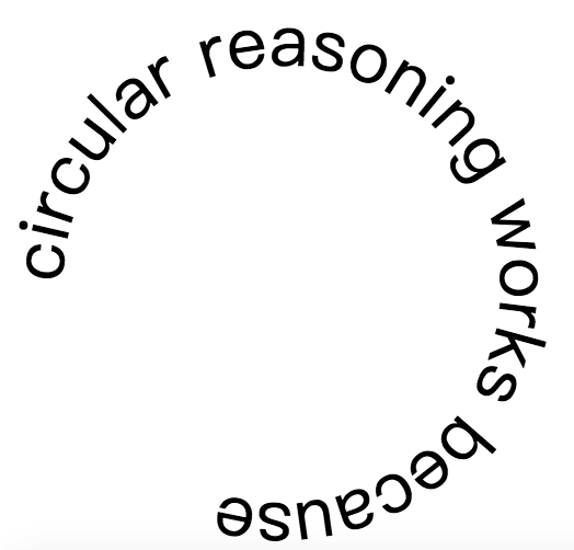
环形文字
1
2
3
4
5
6
7
8
9
10
11
12
13
14
15
16
17
18
19
20
21
22
23
24
25
26
27
28
29.circular {
width: 400px;
height: 400px;
margin: 400px auto;
}
.circular path {
fill: none;
}
.circular svg {
overflow: visible;
}
<div class="circular">
<svg viewBox="0 0 100 100">
<!--
M 0,50 移动到点(0,50)
a 50,50 0 1,1 0,1 以当前所在的这个点为起点,以当前点右侧 0 单位、下方 1 单位的那个点为终点,画一段圆弧。
这段圆弧的水平 半径和垂直半径都必须是 50。如果存在两种可能的圆弧度数,选择 度数较大的那一种;
同时,如果存在两种可能的圆弧方向,选择画 在这两个点右侧的那一种,而不是左侧的
z 闭合
-->
<path d="M 0,50 a 50,50 0 1,1 0,1 z" id="circle" />
<text>
<textPath xlink:href="#circle">
circular reasoning works because
</textPath>
</text>
</svg>
</div>
用户体验
选用合适的鼠标光标
- 禁用
cursor: not-allowed - 隐藏
cursor: none
扩大可点击区域
- 利用边框
1 | border: 10px solid trasparent; |
- 利用伪元素
1
2
3
4
5
6button::before {
content: '';
position: absolute;
top: -10px; right: -10px;
bottom: -10px; left: -10px;
}
自定义复选框
- 自定义复选框/单选框
- 开关式按钮
利用label,具体略
滚动提示
1 | <ul> |
交互式的图片对比控件
- resize方案
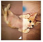
1 | img { |
- js方案
1 | img { |
结构与布局
自适应内部元素
1 | figure { |
精确控制表格列宽
关于table几个重要的属性
1 | table-layout: fixed; /* 可以精确控制单元格的宽度 */ |
根据兄弟元素的数量来设置样式
1 | li { |
同理,可以利用这个技巧来实现列表项的总数大于等于4时选中所有列表:
1 | li:first-child:nth-last-child(n+4), |
或者,当列表项为2~6时,选中整个列表:
1 | li:first-child:nth-last-child(n+2):nth-last-child(-n+6), |
满幅的背景,定宽的内容
一般做法:
1 | <footer> |
更加简单的方法:
1 | <footer> |
垂直居中
基于绝对定位的方法
基于视口单位的解决方案
只适用于视口居中,如果main的父元素出现了滚动条,则不适合
1 | main { |
- flexbox
1 | body { |
紧贴底部的页脚
参考:
https://css-tricks.com/couple-takes-sticky-footer/
- 内容底部负边距
1 | .wrapper { |
- 页脚上部负边距
1 | .content { |
- calc
局限:对容器中的布局不适合
1 | <div class="content"> |
- flexbox
1 | body { |
过渡与动画
缓动效果
提示:
对取
auto值的height属性进行动画效果不生效时可以使用max-heighttransition: .5s height, .8s .5s width
参考:
CSS3动画那么强,requestAnimationFrame还有毛线用?
缓动提示框:
1 | label { |
逐帧动画
闪烁效果
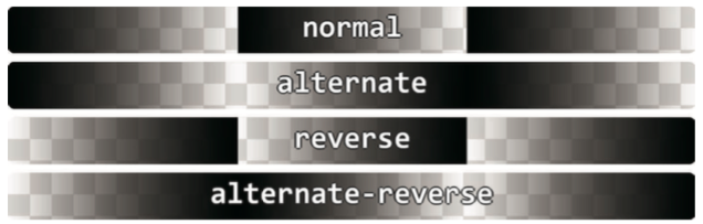
animation-direction
- 反转循环周期,同时反转调整函数
- reverse 反转所有
- alternate 反转偶数个
- alternate-reverse 反转奇数个
1 | @keyframes blink-smooth { |
如果不想要平滑的过渡,可以使用steps
1 | @keyframes blink-smooth { |
打字动画
1 | @keyframes typing { |
状态平滑的动画
1 | @keyframes panoramic { |
沿环形路径平移的动画
下列代码可以实现基本需求,但是头像也倒过来了,有什么办法可以解决呢
1 | @keyframes spin { |
利用辅助元素
- 利用相反动画抵消
1 | @keyframes spin { |
- 利用
animation-direction1
2
3
4
5.avatar img {
...
animation: inherit;
animation-direction: reverse; /* 抵消外层动画 */
}
不添加元素
1 | @keyframes spin { |
进一步简化:
表示不理解!!!
1 | @keyframes spin { |